Language: Português (BR) · Español
Heatmaps in IPSC to see performance patterns
Heatmaps visually show where performance is strong and where you need to adjust speed, accuracy or balance between the two at each stage.
heatmap ipsc desempenho por stage pontos e hit factor
Heat maps in IM hub
Choose the test and use the graphics area of the hub for heatmaps and visual comparisons.
Quick actions
Jump straight to import tools and related guides.
Guide: athlete comparison
Suggested flow to compare up to four athletes in the same race.
Read athlete comparisonsWhat you get on this page
- Map by stage with comparison between athletes.
- Visual reading of points x hit factor.
- Quick diagnosis for targeted training.
Quick summary
- Map by stage with comparison between athletes.
- Visual reading of points x hit factor.
- Quick diagnosis for targeted training.
- See the sections below and the shortcuts to apply to your test or transmission.
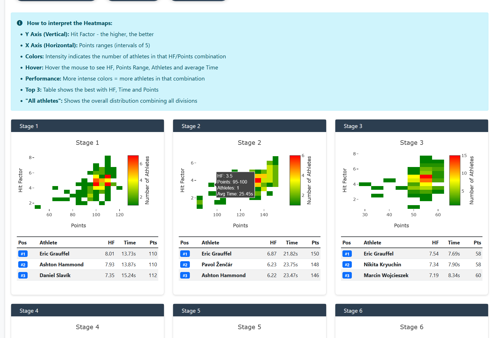
How to read the heat map in practice
In the hub's heatmaps, each point usually represents an athlete on a track (stage): one axis shows the track's score (or the percentage of the best in the division) and the other the hit factor or time. Higher points and points to the right indicate a strong combination of points and rhythm in that cut; lower or left corners suggest loss of accuracy, overtime, or both — always compare athletes from the same division and category for a fair reading on the IPSC.
Within-division comparison
Reading becomes more useful when you compare athletes in the same competitive context, avoiding distorted analyses.
Application in the training cycle
The heat map speeds up training prioritization: rhythm between targets, transitions, recoil control and shot decision depending on the type of track (short, medium or long on the course).
Continue in the Scoring Services ecosystem
This article is part of /guia-ipsc. To apply it in practice, open a test at https://im.scoring.services/list or follow the steps at /matches. Recreational athletes can start with the comprehensive guide at /tiro-practico-guide-completo.
After the heatmap
Open /dados-por-stages-ipsc in the worst regions of the map and validate in /comparacao against a reference athlete.
How to read heatmap quadrants
Top right (lots of points + high hit factor) = excellent performance. Bottom left (few points + low HF) = needs improvement. Many points with low HF = needs to be faster; High HF with few points = needs to be more precise. Use this to decide whether to train speed or accuracy and compare with athletes in the same division.
Heatmaps by stage
Visual distribution of hit factor vs points, with top 3 and interpretation legend.
Heatmaps by stage
Visual distribution of hit factor vs points, with top 3 and interpretation legend.
Heatmaps by stage
Visual distribution of hit factor vs points, with top 3 and interpretation legend.
Heatmaps by stage
Visual distribution of hit factor vs points, with top 3 and interpretation legend.
Tools on the IM hub
Direct links to im.scoring.services — match list, import, athlete search, editors, and more.
All hub features
Each card opens a dedicated area of the import and analysis hub.
Division statistics
Compare averages and distributions within the same IPSC division.
Athletes by divisionPlatform statistics
Distribution by division, state, match level and macro view of imported data.
Open platform statsIPSC Stage Designer
Draw stages in the browser — WSB, PDF, materials and RO link.
Open Stage DesignerExplore more in the IPSC guide
Frequently asked questions
Apoiadores